Scroll-Triggered CSS Animation: SVG Line Reveals Card (Requested by YOU!)
I have created a demo requested by a YouTube subscriber. Here is what the subscriber asked for.

This question came of my CSS only! SVG line animation on scroll; circle moving along the line on scroll Video. If you want to learn how the line animation works in detail, watch this video, as I won’t explain it here.
Below is the final demo of the requested animation. I will explain how to synchronize the line animation with scrolling to create this effect.
I also made a YouTube video explaining this; check it out here!
Animation Overview
The requested animation comprises the following key elements:
- Card Reveal Animation–The animation hides cards initially, then fades them in as the pointer reaches them.
- Line Animation–A vertical line extends downward, connecting the cards.
- Pointer Animation–A small circle moves along the line, acting as a visual indicator.
- Scroll-Driven Control–The scrollbar synchronizes the entire animation.
As the user scrolls, the line progresses downward, with the pointer moving along it. When the pointer reaches a card, the card appears. This process continues until the user reveals all cards.
Setup:
A container having 3 cards in it at some distance apart. SVG line is on top of the cards lay through position absolute value. Only adding the important CSS here. Rest is just decorative purposes that you can check in CodePen provided.
<div class="container">
	<div class="cards-container">
		<div class="card">
			<h3>Card 1</h3>
			<p>First card content</p>
		</div>
		<div class="card">
			<h3>Card 2</h3>
			<p>Second card content</p>
		</div>
		<div class="card">
			<h3>Card 3</h3>
			<p>Third card content</p>
		</div>
	</div>
	<svg class="line-animation" viewBox="0 0 100 200" width="500px">
		<path
			class="line-running"
			d="M50,0 L50,110"
			stroke="#F2CB05"
			stroke-width="2"
			fill="none"
			pathLength="1"
		/>
		<circle class="moving-circle" cx="50" cy="6" r="3" fill="#F26D78" />
	</svg>
</div>
.line-animation {
position: absolute;
top: -8rem;
z-index: -1;
}- Write the animation keyframe to reveal the card.
.card {
  ...
  opacity: 0.3;
  animation: revealCard 0.5s forwards linear;
}

@keyframes revealCard {
 to {
  opacity: 1;
 }
}- Write the animation keyframe for line animation. Also add
pathLength=1attribute to the SVG path(IMPORTANT!)
.line-running {
	stroke-dasharray: 1;
	stroke-dashoffset: 1;
	animation: line-animation 5s linear forwards;
}
@keyframes line-animation {
	from {
		stroke-dashoffset: 1;
	}
	to {
		stroke-dashoffset: 0;
	}
}- Write the animation keyframe for circle animation to follow the line.
.moving-circle {
	transform-box: fill-box;
	offset-anchor: 50% 50%;
	offset-path: path("M50,0 L50,110");
	animation: move 5s linear forwards;
}
@keyframes move {
	to {
		offset-distance: 100%;
	}
}
Till here we have created all the animations individually.
Scroll-Driven Synchronization
We use the following properties to bind animations to scroll events.
.class {
	animation: animationName 5s linear forwards;
	animation-timeline: scroll(

	); // this tells browser that the animation written above attach it to the scrollbar
	animation-range-start: 4.5%; // This value tells browser from where animation should starts in scrollTimeline
	animation-range-end: 4.6%; // This value tells browser from where animation should end in scrollTimeline
}
Explanation:
animation-timeline: scroll();–Attaches the animation to the scrollbar.animation-range-start–Defines when the animation begins relative to scrolling.animation-range-end–Defines when the animation completes relative to scrolling.
Finding optimal animation-range-start and animation-range-end values can be challenging.
Lets find out values for the line and circle move on scroll.
Line running and circle moving will use the same start and end points, since they move together. The start value kicks in as soon as you move the scroll bar a bit, at 2%, and the end value stays at 15% until the line goes past all the cards.
The next section shows the exact debugging process for obtaining the values.
.line-running {
  ...
  animation: line-animation 5s linear forwards;
  animation-timeline: scroll();
  animation-range-start: 2%;
  animation-range-end: 15%;
}
.moving-circle {
  ...
  animation: move 5s linear forwards;
  animation-timeline: scroll();
  animation-range-start: 2%;
  animation-range-end: 15%;
}
Lets find out values for the first card reveal on scroll.
The Scroll Driven Animations Chrome extension by Bramus help visualize these values.
Note: The extension only works if the rendering of HTML and CSS occurs outside an iframe.
If using CodePen then use Debug mode view of this to use Scroll-Driven Animations extension.
Here is image shows the debugging with scroll driven animation. I have given different colors for everything. So that I can address them properly.
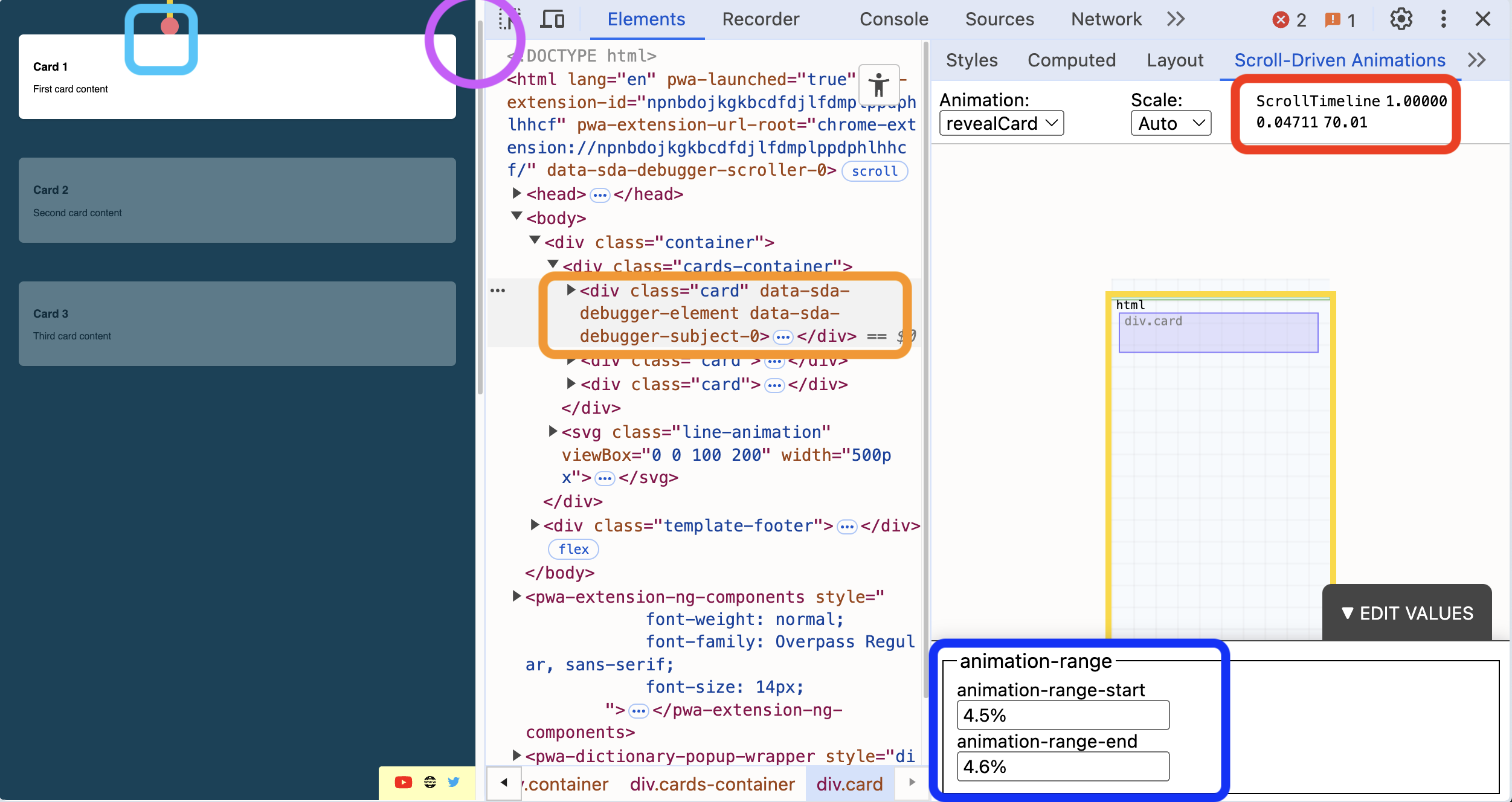
- Orange color box shows the element selected. This is very important. You need to select en element to find out its values and movement in timeline. Also, add
animation-timeline: scroll()for it to appear in the debugger. - Purple color circle shows how much a scrollbar has moved. Red color box shows its values. There are two values: horizontal and vertical. For the scrolling thing, we’ll go with the last one, which is 0.04711 in this case. If you divide that number by 100, you get 4.7%.
- Navy blue color box will let us enter the range start and range end values for the selected element. Here it could have been 4.7% but we liked 4.5% as this was best suited. The animation will end based on the range end value.
- The sky blue color box where the circle touches the card is the point we want to start the card reveal animation. According to this, we have to decide values for range start and range end.
Repeat for cards two and three. Check the entire code in CodePen demo.
And Tada!