Only CSS! Layered panels horizontally moving on scroll with text
In this blog will create layered panel animation on scroll horizontal and vertical with only CSS. The text animation slides up when scrolling. First, I will explain the horizontal by breaking it down into different components. The vertical is exactly the same, but with a slight change.
I became inspired to create this after coming across a CodePen Demo that showcased the creative use of GSAP and observer.
I also created a YouTube video of this. Check it out here.
On Vertical scroll panel moving horizontally on scroll with text
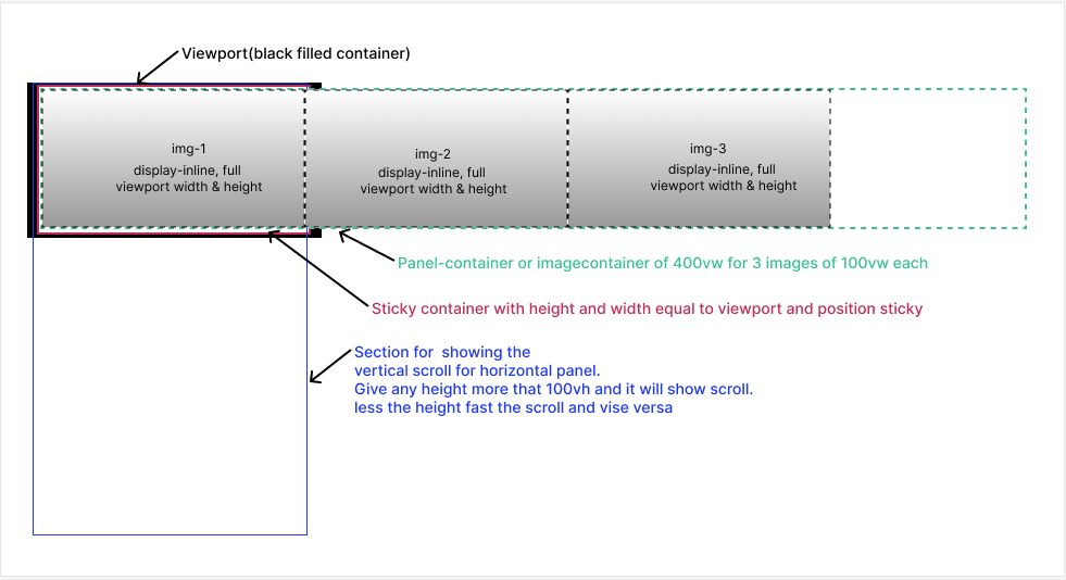
There are a few key concepts for this
- Make a container which will give us space for vertical scrolling even though we are moving panels horizontally.
- Making another wrapper just for the making it look like a sticky or pinned container if you are familiar with GreenSock.
- The scroll timeline range for the panel, as well as for the text inside it, is being systematically set to run smoothly in a sequence.
Here is the visual for this setup:

Step 1: Panels
Incorporate three panels that span the entire width and height of the viewport. Apply a background image to each panel and style them accordingly. Use flex to align the text in the center.
.panel {
	width: 100vw;
	height: 100vh;
	//To scroll the panels using transform
	will-change: transform;
	//To center the text inside it
	display: flex;
	justify-content: center;
	align-items: center;
	//Image styling
	background-size: cover;
	background-repeat: no-repeat;
}
Step 2: Panels container
Put a panel container around these panels to group them. Give width that exceeds the required width for three panels. I added 350vmax. Add display flex to arrange all the panels horizontally.
.panel-container {
	height: 100vh;
	width: 350vmax;
	display: flex;
}
Step 3: Sticky container above panels container
Put another container on top of the panel container and make it stick. Give it full width, height, and make it stick.
.pin-wrap-sticky {
	/* Stick to Top */
	height: 100vh;
	width: 100vw;
	position: sticky;
	top: 0;
}
Step 4: Section above Sticky container
This is a must for creating height. I prefer vertical scrolling for better UX, even though the panels move horizontally. Apply overflow-x: clip to remove the horizontal scroll.
section {
	height: 200vh;
	overflow-x: clip;
}
Now, let’s animate the Panels. The idea is to move each panel to the left corner of the viewport when scrolling. We’ll use the negative x value for this. Since all the panels take up the whole screen, the values will be -100vw for the first panel and -200vw for the second panel. Easing will be linear and fill mode is both. This works best with scroll animations. The duration of this animation is not set because it is triggered and executed by scroll.
.second-panel {
	animation: linear moveSecondPanel both;
}
.third-panel {
	animation: linear moveThirdPanel both;
}
@keyframes moveSecondPanel {
	to {
		transform: translate(-100vw, 0px);
	}
}
@keyframes moveThirdPanel {
	to {
		transform: translate(-200vw, 0px);
	}
}
Putting these animations in a scrollable container. Since there are only 3 panels out of which the first panel will be as it is. As the user scrolls, we need to only 2 panels, so I divided animations range in to two parts 0-50% and 50%-100% respectively for first and second panel.
.second-panel {
	animation: linear moveSecondPanel forwards;
	animation-timeline: scroll();
	animation-range-start: 50%;
	animation-range-end: 100%;
}
.third-panel {
	animation: linear moveThirdPanel forwards;
	animation-timeline: scroll();
	animation-range-start: 50%;
	animation-range-end: 100%;
}
scroll() will attach animation to the scrollbar. And the animation range will decide when this animation will start.
Step 5: Text animation
At the center of the panel, there is a title text, prominently displayed. First panels text will slide up as it is on page load. As you scroll through the page, the text for the second and third panels will activate. The initial keyframes will set the opacity to 0, causing the text to be hidden. There will be a transformation in the positive y direction, pushing the text downwards initially. Finally, it will revert to its original position, with an opacity of 100%.
@keyframes moveUp {
	100% {
		opacity: 1;
		transform: translate(0%, 0%);
	}
	0% {
		opacity: 0;
		transform: translate(0%, 150%);
	}
}
Let’s add this animation to the first panel. Each character of the text requires this animation. We use a span to wrap each character. Put these side by side using flex in the parent.
<h2 class="section-heading">
	<span>S</span>
	<span>C</span>
	<span>R</span>
	//Rest characters inside span....
</h2>
I looped through sass’s for loop to keep delaying each character. Targeting each character using nth-child and giving an increasing delay using variable multiplies by 0.2s. The animation duration is 1s since a scroll does not trigger it.
// first panel
@for $i from 1 through 11 {
	.first-panel h2 span:nth-child(1n + #{$i}) {
		animation: 1s moveUp $i * 0.2s ease-out both;
	}
}
Use the same animation for second and third panel characters, attaching it to the scroll. Removed delay and duration from the animation. Animates each character on scroll movement. Animation range will increase by +1 for each character, creating a delaying effect.
A key consideration is that the text in the second panel should stay within the 0-50% scroll range, as should the third panel. I started the second panel’s text from 25% and the third panel’s text from 80% so that the panel is slightly visible and then the text comes in.
// Second panel
@for $i from 1 through 15 {
	.second-panel h2 span:nth-child(1n + #{$i}) {
		animation: moveUp linear both;
		animation-timeline: scroll();
		animation-range-start: calc(#{$i}% + 25%);
		animation-range-end: calc(#{$i}% + 30%);
	}
}
// Third panel
@for $i from 1 through 20 {
	.third-panel h2 span:nth-child(1n + #{$i}) {
		animation: moveUp linear both;
		animation-timeline: scroll();
		animation-range-start: calc(#{$i}% + 75%);
		animation-range-end: calc(#{$i}% + 80%);
	}
}
You can also hide the scrollbar from the UI if you wish by adding below code.
// To hide the scrollbar visually
html {
	scrollbar-width: none; /* Firefox */
}
body {
	-ms-overflow-style: none; /* IE and Edge */
}
body::-webkit-scrollbar {
	display: none; /* Chrome, Safari, Opera */
}
TADA! here it is done.
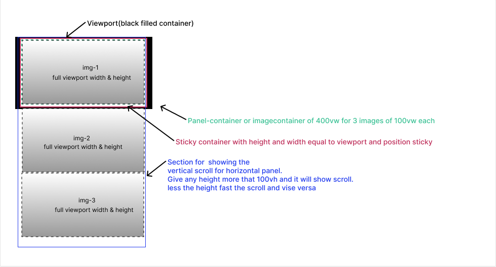
On Vertical scroll panel moving vertically on scroll with text
The process is like horizontal scrolling with no need for a panel container width and allowing panels to flow naturally. The demo does not have any additional text, but the process remains the same.
