Impact of CSS Grid
CSS Grid is around from quit some time now. There are plenty of books, courses, articles available to learn CSS Grid. In this post, I won’t teach CSS Grid but I’ll talk about how I got started with it, the problems it solved, and its impact on developers’ lives.
Story
I am in this industry for over 7 years. I started learning frontend development with HTML and CSS. Creating layouts is one of my favourite thing to do. When I started, we used to create layouts, mostly using float, percentages, positions and, of course, a lot of div. Also used framework like Bootstrap. Making a text vertically align was like writing lines of code. Making a web page responsive was a challenge, especially if the source order and display order of contents were different. I learned about Flexbox after a year. Flexbox helped in creating layouts in one direction, making things centre aligned, making flexible box layouts easy, etc. Creating layouts for two dimensions was still the problem. It’s difficult for non-UI guys to find something they can quickly use for simple layouts. Then the CSS grid came.
History
CSS Grid was being discussed and present as a draft proposal for many years. In 2017, most modern browsers implemented this. This time, people actually started using it in production.
Technical Impact
CSS Grid has given the structure to the layout. It has helped in keeping the HTML and styles as separate concerns. It made it easy for people to think about how to structure the layout. This has totally changed the way we think about creating layouts. I was so amazed, that I wrote a blog post “Thinking in CSS Grid” (https://medium.com/statuscode/thinking-in-css-grid-48922b25ee69). This was my second blog post. It got published in Medium publication — StatusCode.
Lining things up in two dimensions is exactly what Grid is for.
Certain common layouts built using CSS grids are responsive and performant by default.
It is possible to nest and create grids at any level in the layout. Subgrids are also very useful in creating nested grids.
The ease of implementation has freed the designer to come up with creative layouts, which are not just boxes.
With developers and designers both using a grid system in their work, we have a common vocabulary to discuss designs.
Fr fraction units which came with CSS Grids, it is also very useful in writing more legible and maintainable code. No need for percentages or calc() with the new layout system. My first blog was on “CSS Grid all about Fr units” https://medium.com/@r_tripti/css-grids-all-about-fr-units-36b7b5fea661. This is also a very good article https://css-tricks.com/introduction-fr-css-unit/.
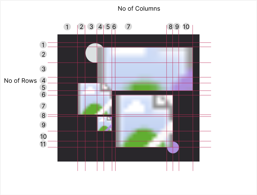
We can structure a layout like how we see it. How cool is that? Like you see in the picture, we can set up the columns and rows exactly like that and put everything in the right spot. Like, we can define the top image as column 4 to the end and row 2 to 5.
.image-1 { grid-column: 4/-1; grid-row: 2/5;}

Behavioural Impact
I gave a presentation on CSS Grid in my previous company. My PM stated creating simple layouts for his personal projects :) and the happiness of backend devs that they can also do some CSS work was amazing to see. The main idea I want to convey is that CSS Grid not only improved the web but also engaged more individuals.